art

The RedBall Project

The RedBall Project makes me so freakin’ happy.

The concept is simple: A giant red, inflatable ball travels the world and is wedged into structures in different cities—much to the delight of those who stumble upon it.

It’s the creation of Brooklyn-based sculptor Kurt Perschke. The RedBall Project is meant to excite and inspire participation, as he describes it:

Through the magnetic, playful, and charismatic nature of the RedBall the work is able to access the imagination embedded in all of us…It opens a doorway to imagine what if? As RedBall travels around the world people approach me on the street with excited suggestions about where to put it in their city. In that moment the person is not a spectator but a participant in the act of imagination.

Cute, crazy, beautiful,В whimsical and just so much fun. (Kinda like that giant, inflatable duck that’s also made its way around the world.)

RedBall is currently in Montreal…

Red Ball Project | Montreal

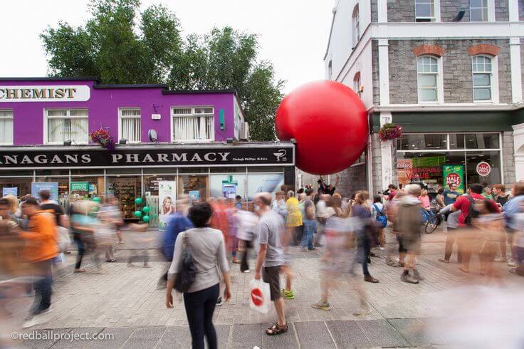
…and has already been to Galway

Red Ball Project | Galway

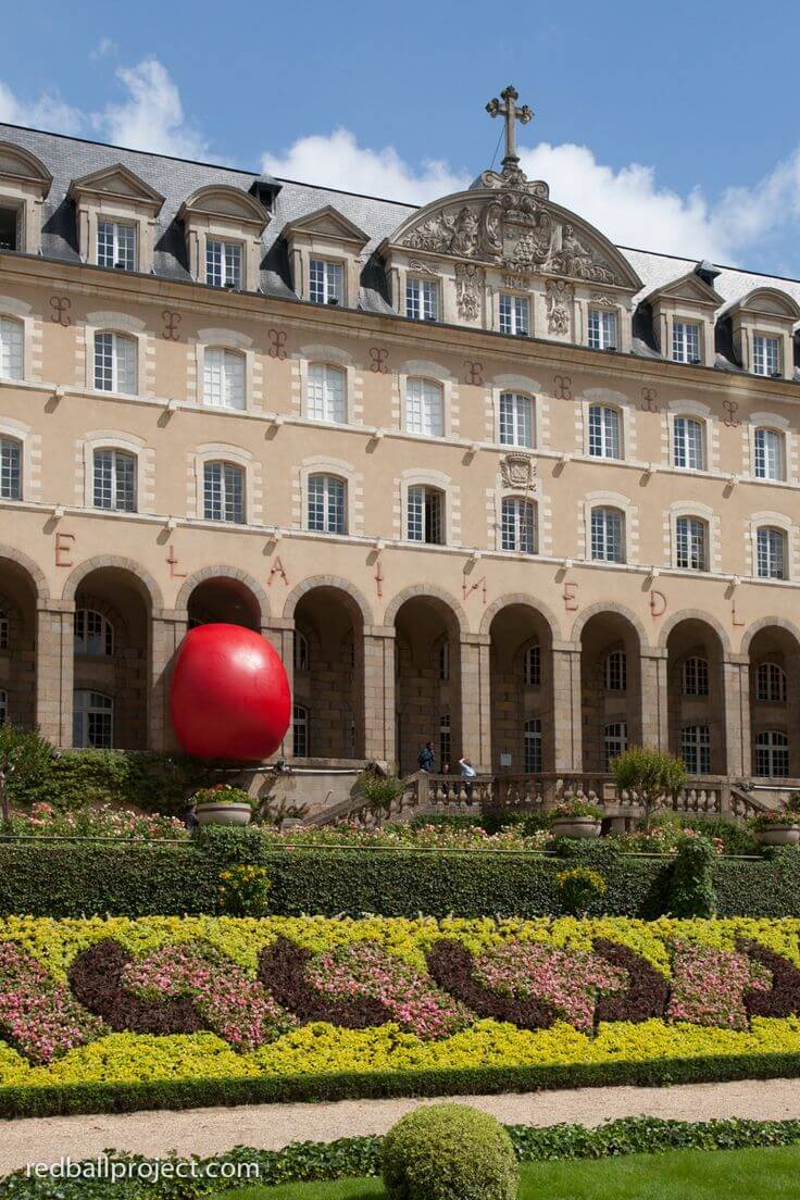
Rennes

Red Ball Project | Rennes

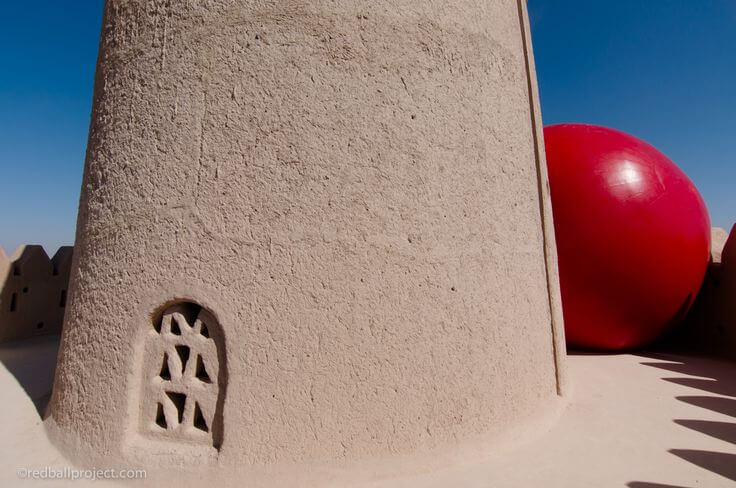
…and Abu Dhabi, among other locations.

Red Ball Project | Abu Dhabi

I’m hoping it makes a stop in NYC, sometime soon.

(Images via the RedBall Project; found via Travel + Leisure )

Archie’s Press’ Circular City Maps

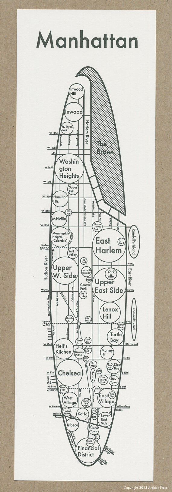
Here’s another map I stumbled upon and loved, this week: Manhattan, as interpreted by Archie Archambault, a designer from Portland, Oregon.

Manhattan map, by Archie's Press

My eye was drawn toВ the clean lines and the simplicity of the circles. Plus, he did a nice job calling out most NYC neighborhoods. (Though he could have included my own little ‘hood, Hudson Heights, in that blank spot between 180th and 190th, between the river and Broadway!)

On his site, Archambault explains why he uses circlesВ in his maps:

New research indicates that GPS’s are hindering our ability to create mental maps of our surroundings. My maps aim to install a “Map from the Mind” for each city, simplifying structures and districts in the simplest terms. The circle, our Universe’s softest shape, is the clearest graphic to convey size & connection.

Archambault has also mapped San Fran, DC, Boston, PortlandВ and many other cities. See them all on his Etsy shop.

(Image viaВ Archie’s Press; found via Pinterest)

Aldo Crusher’s Amazing Cityscapes

Aldo Crusher‘s illustrations just make me happy.

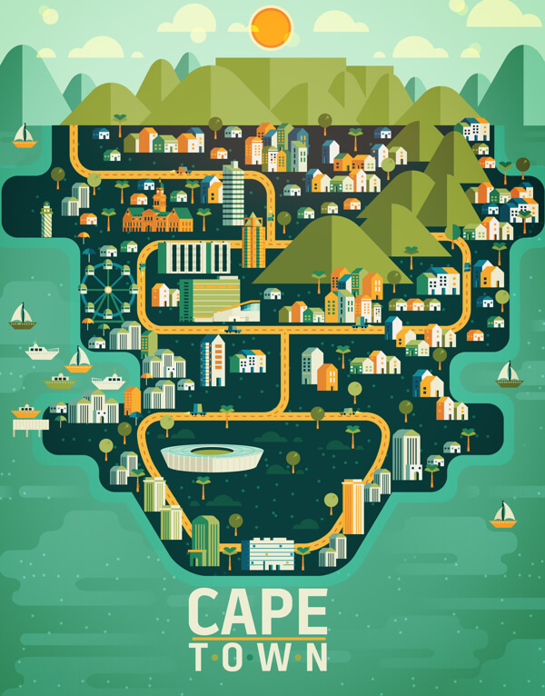
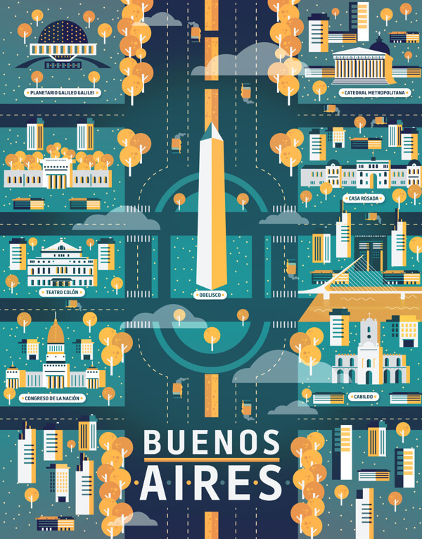
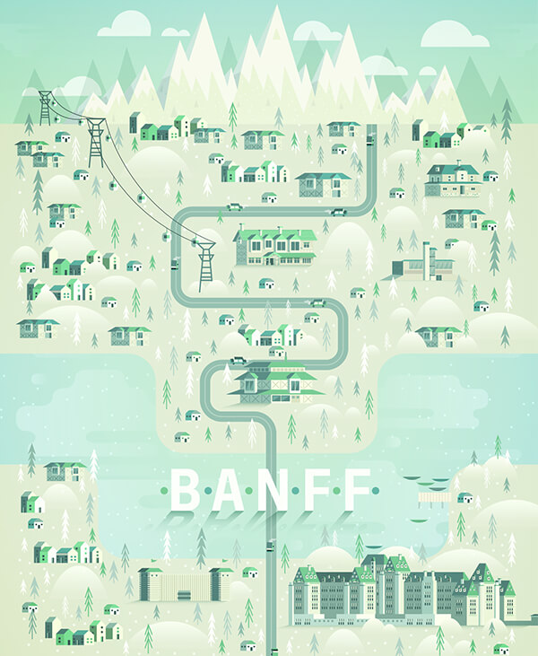
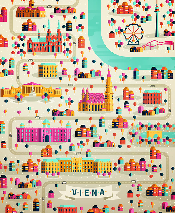
The Mexico City-based artistВ has two gorgeousВ series, CosmГіpolisВ andВ CosmГіpolis Pt.2, where he depicts cities around the world in whimsical, colorful detail.

They’re incredibly wanderlust-inducing.

IВ don’t think I need to say more about how awesome they are—the images speak for themselves.

Cape Town, by Aldo Crusher

Buenos Aires, by Aldo Crusher

Banff, by Aldo Crusher

Vienna, by Aldo Crusher

(Images by Aldo Crusher; found via Design Taxi)

New Yorker Beach Covers

Though I haven’t taken any other summer trips since LBI, I’ve made a point to hit the beach at least one day eachВ weekend. Like I’ve been saying—the sun and surf are so refreshing after a week spent in an air-conditioned midtown office building!

Sure, NYC-area beaches don’t have the cleanest sand or prettiest water. And yeah, they can get crowded. But I do love seeing my fellow New Yorkers, from all walks of life, basking in the sun and splashing in the water.

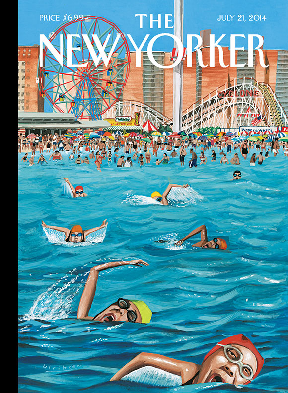
That’s why I love this week’s New Yorker cover, byВ Mark Ulriksen,В celebratingВ summer on Coney Island: It’s a vibrant and accurate depiction of New Yorkers taking advantage of their beach within the city. (Funny, I’ve been to Long Beach, Rockaway, Robert Moses and Jones, but not Coney Island, this year.)

MARK ULRIKSEN’S “CONEY ISLAND”

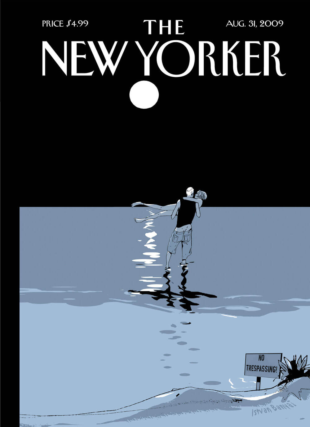
The magazine also has a gallery of past covers that featured the beach. I loved this one, from 2009, of a couple wading in the moonlight:

banyai couple

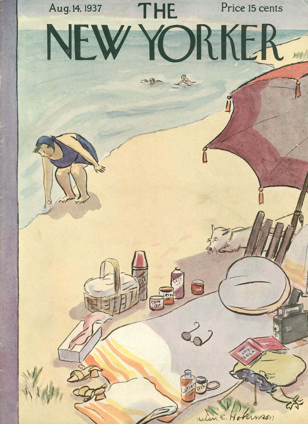
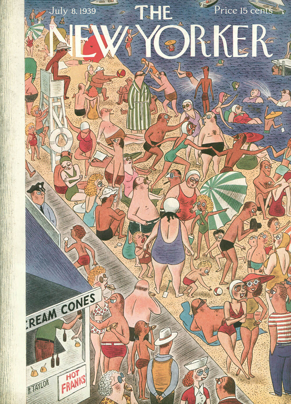
And I really got a kick out of these two, from the 1930s:

1937_08_14_Hokinson_Beach

1939_07_08_Taylor_Beach

It’s amazing how little a day at the beach has changed since then. The styles and technology are different, but packing a picnic and/or eating hot dogs and battling crowds are still part of the experience!

(Images via the New Yorker )

NYC Artist Gives Late Father His Dream Trip

I found this so moving:

Jinna Yang is an NYC-based artist who was raised by her father. He was a PGA-certified pro golfer, but was never able to tour because he wasВ taking care of his family. Instead, he owned a dry cleaning business in Virginia, and dreamed of traveling the world.

Unfortunately, he never had the chance to do so. He passed away from stomach cancer at the age of 52.

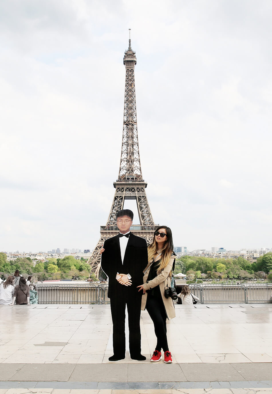
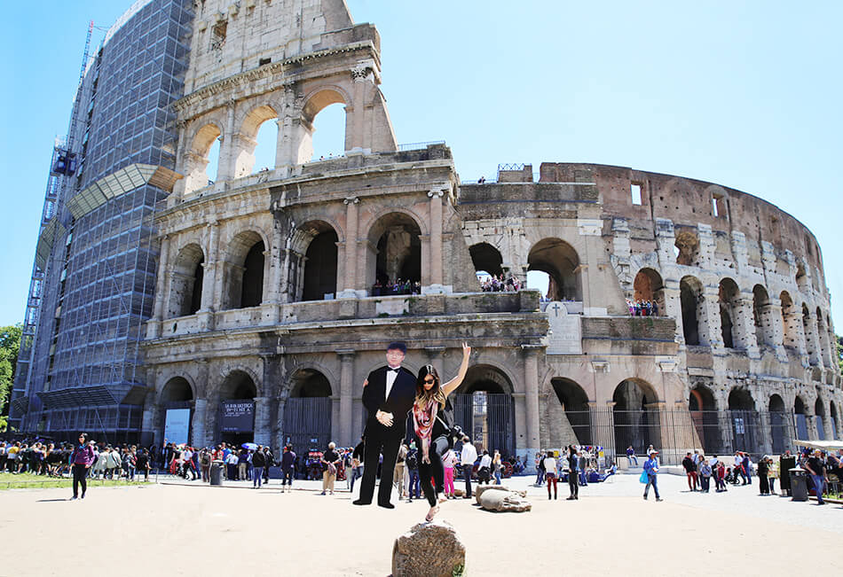
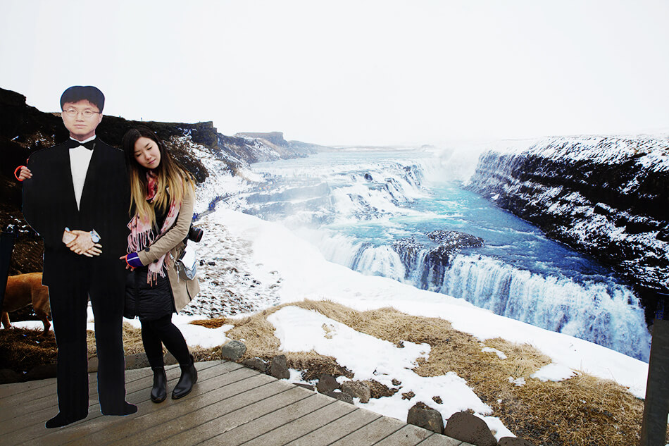
After more than a year of grieving her father, Yang decided to give her father what he always wanted: the opportunity to travel. She set off on a month-long trip through Europe, with a six-foot tall cutout of her dad. Along the way, she posed for photos with him at famous landmarks:

05_me_dad_parisIMG_4168

04_me_dad_colosseo-copy

00-dad_gulfoss_iceland_full_res-copy

Upon returning, Yang’s photos have gotten a lot of buzz. But better yet, her trip helped her and her family in the healing process. In a follow-up note on her blog, she writes:

My entire family was so moved from the support we’ve received through the community, and the photographs of me and my dad together around the world made them so happy. It was such an amazing feeling to see my grandmother, mother, brother, cousins and aunts/uncles so excited to see the photographs. It brought me and my family a form of peace, and that was the purpose of this project.

Beyond these photos, Yang’s blog is pretty awesome—so be sure it check it out!

(Images via Grease and Glamour; thanks to Evan for showing this to me)

An Alphabet Inspired by Cities

This has to be one of the coolest senior theses I’ve ever seen.

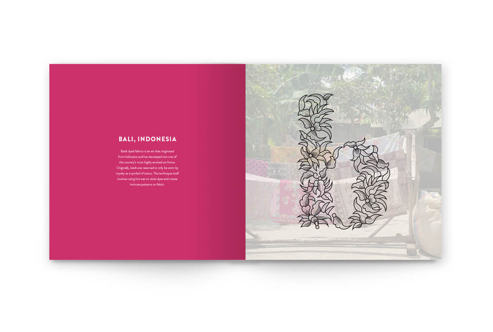
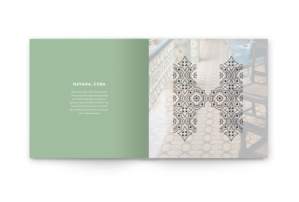
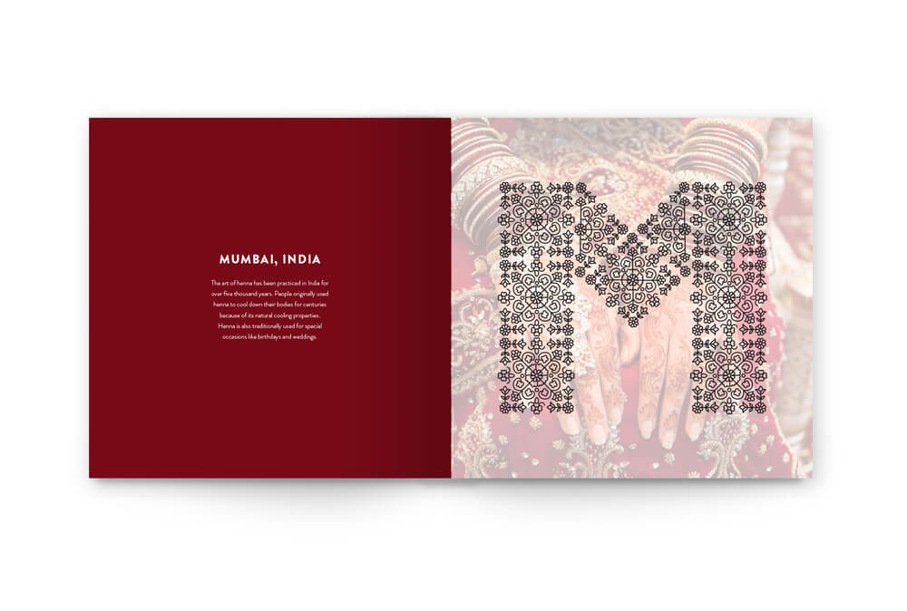
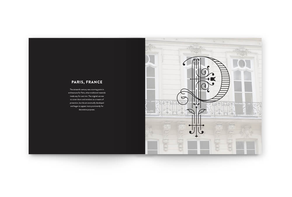
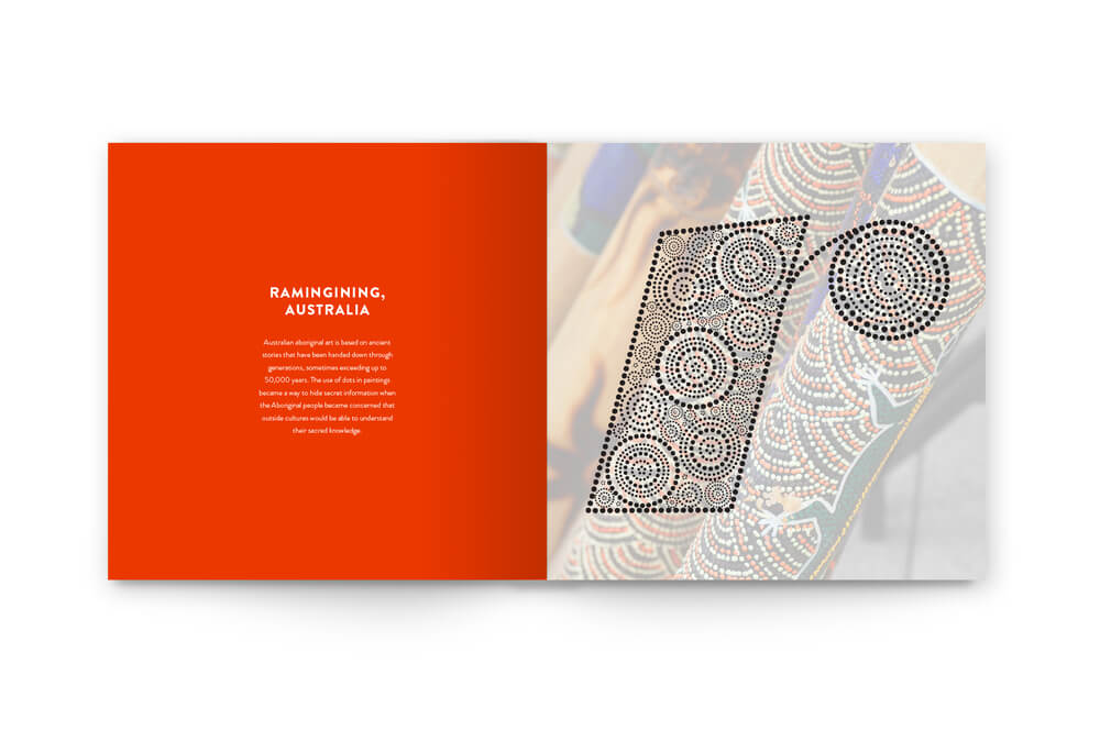
Graphic designer Rebecca Mah created an alphabet in which each letter is inspired by a different city. The letters are meant to be “drop caps,” which are the large first letters at the start of a paragraph, usually in a book.

I loved looking through all the letters, though these especially caught my eye:

B01

H01

M01

P01

R01


See Mah’s full alphabet here. Which is your favorite?

(Images by Rebecca Mah; found via Design Taxi )

Gorgeous Gifs

When I think about.gif"turntable cat" href="https://24.media.tumblr.com/tumblr_m8dynhbpJ01qbbs8oo1_500.gif" target="_blank">this variety.

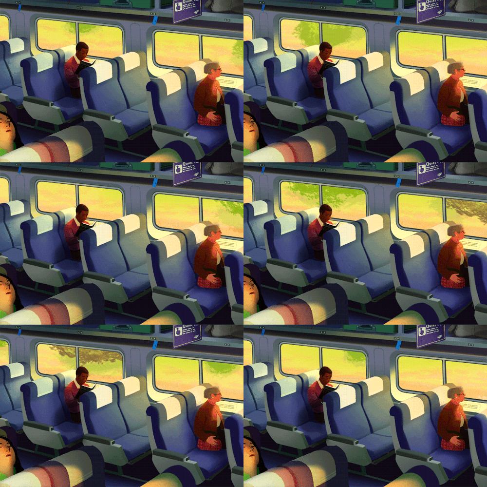
Which is why I was so blown away when I came across Rebecca Mock’s.gif"http://rebeccamock.com/index.php?/nytimes/the-quiet-ones/"> the quiet ones

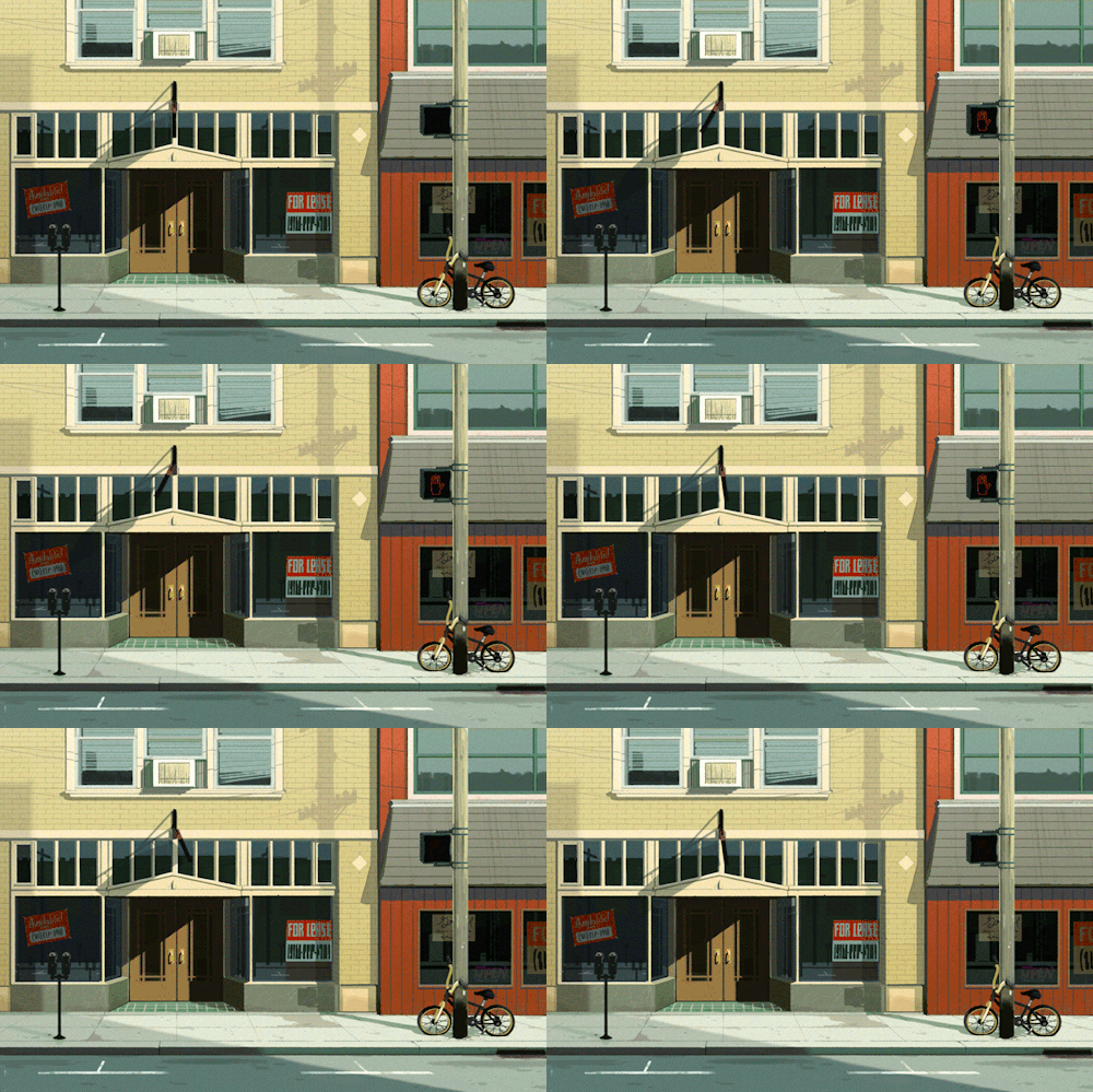
main street blues

This one is my absolute favorite. It so reminds me of sweltering NYC afternoons in the summertime. (How much longer until it’s that hot?)

nothing to do in this heat

Check out more of Mock’s amazing illos on her site, as well as her Tumblr.

(Images by Rebecca Mock; found via NPR)