typography

An Alphabet Inspired by Cities

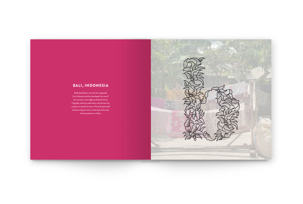
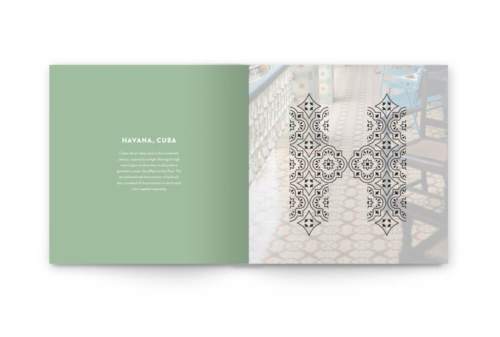
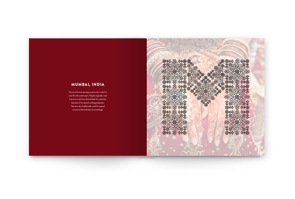
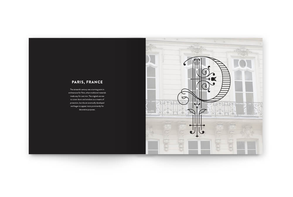
This has to be one of the coolest senior theses I’ve ever seen.

Graphic designer Rebecca Mah created an alphabet in which each letter is inspired by a different city. The letters are meant to be “drop caps,” which are the large first letters at the start of a paragraph, usually in a book.

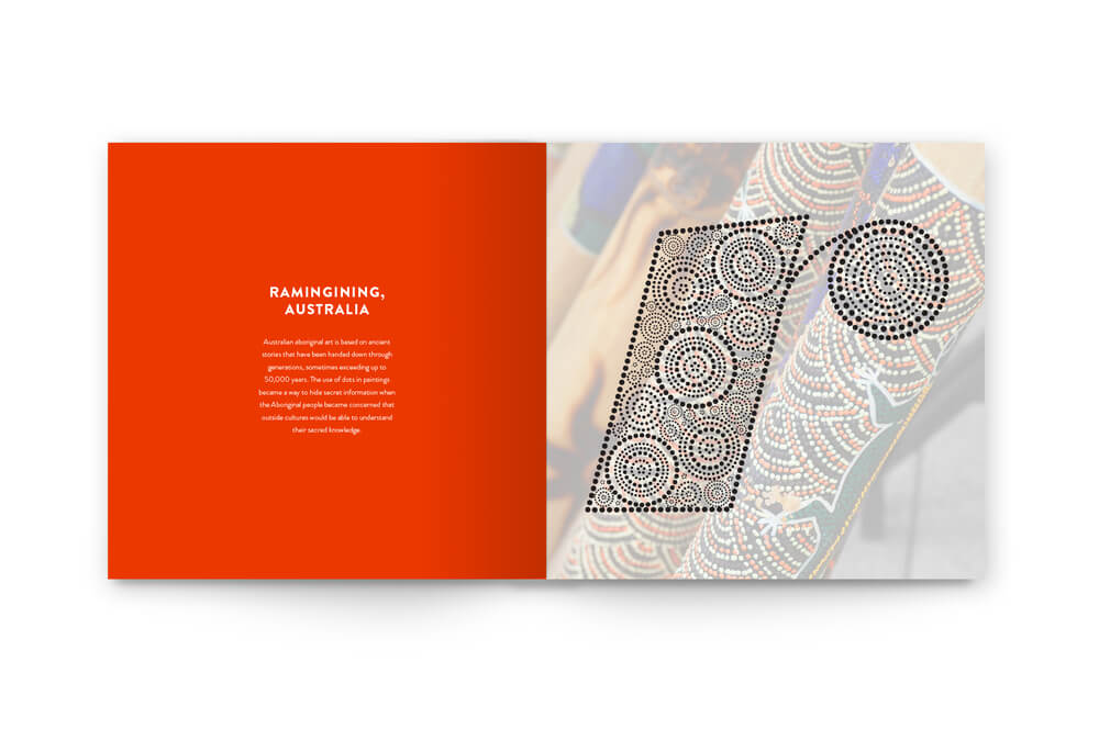
I loved looking through all the letters, though these especially caught my eye:

B01

H01

M01

P01

R01


See Mah’s full alphabet here. Which is your favorite?

(Images by Rebecca Mah; found via Design Taxi )

So Ready for an NYC Weekend!

new york

Happy Friday! I’m spending this weekend doing something I haven’t done in a while–chillin’ in NYC. I’ll be celebrating my best friend’s birthday (happy 3-0, Reen!), going to ballet and watching the Olympics. (I have the parade of nations on as I type–how good-looking are all the athletes?! Also–it’s pretty funny that so many of them, no matter where they’re from, are snapping smartphone photos as they march in.)

Have a great weekend, as well! And enjoy my favorite links from the past few days:

This link made my week

The life of a reporter…told through cat.gif"city map placemats" href="https://nymag.com/shopping/bestbets/computer-brush-new-stuff-2012-7/" target="_blank">Paper placemats that are too cool to use

Fictitious dishes

5 dudes who’ve taken the same photo for 30 years

I suppose this is a benefit to riding the subway!

(Image via Julien-Pierre)