illustrations

Ballet Monsters

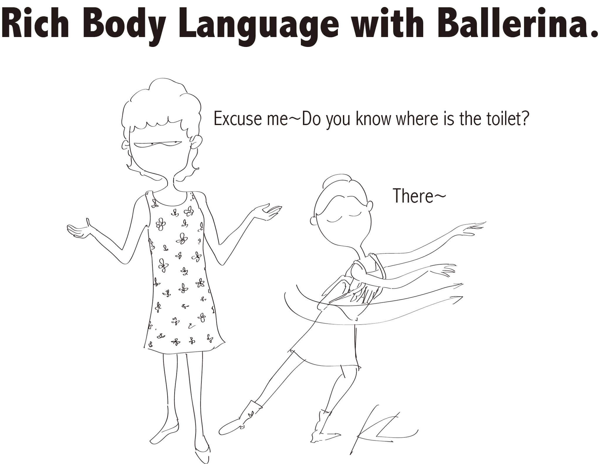
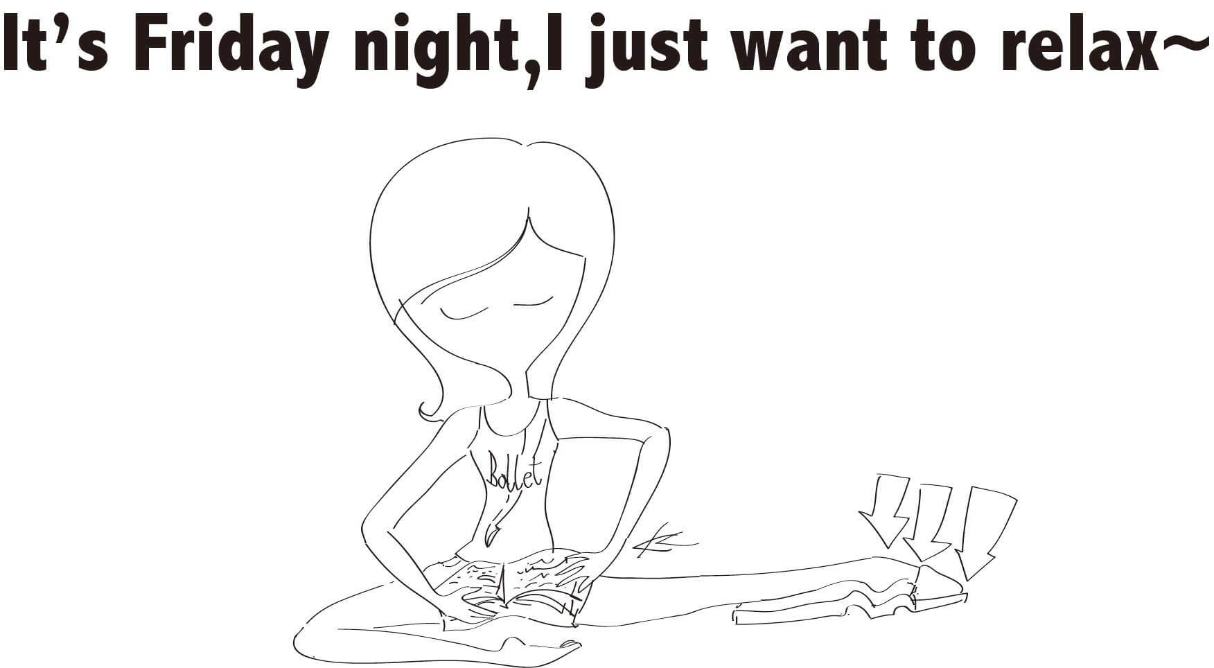
I have to thank New York City Ballet’s Facebook page for introducing me to “Ballet Monsters,” an incredible illustrations series by Taipei artist Keith Lin.

His line drawings are simple, yet they capture ballet so well. Lin’s lithe figures not only have perfect technique; they also convey grace, passion and elegance—despite being virtually faceless.

As Lin told Pointe magazine:

I rely on ballet positions to express feeling. Dancers speak with their bodies onstage, and to me the closed eyes show how they are enjoying the moment. Sometimes I feel like I’m choreographing on paper.

I love how Lin’s figures also cheekily—and accurately!—illustrate the mindset of us ballet addicts. Lin’s closest friends are dancers and he draws his inspiration from them.

A few drawings that I particularly loved (and related to):

ballet monsters 4

ballet monsters 2

ballet monsters 3

В

ballet monsters 1

Check them all out on the two “Ballet Monsters” pages here and here!

(“Ballet Monsters” illustrations by Keith Lin, found via New York City Ballet)

NYC Basic Tips and Etiquette

I’m sure that in every city, there are unspoken but almost universally agreed upon truths and learnings, among residents. Here in NYC, we certainly have tons.

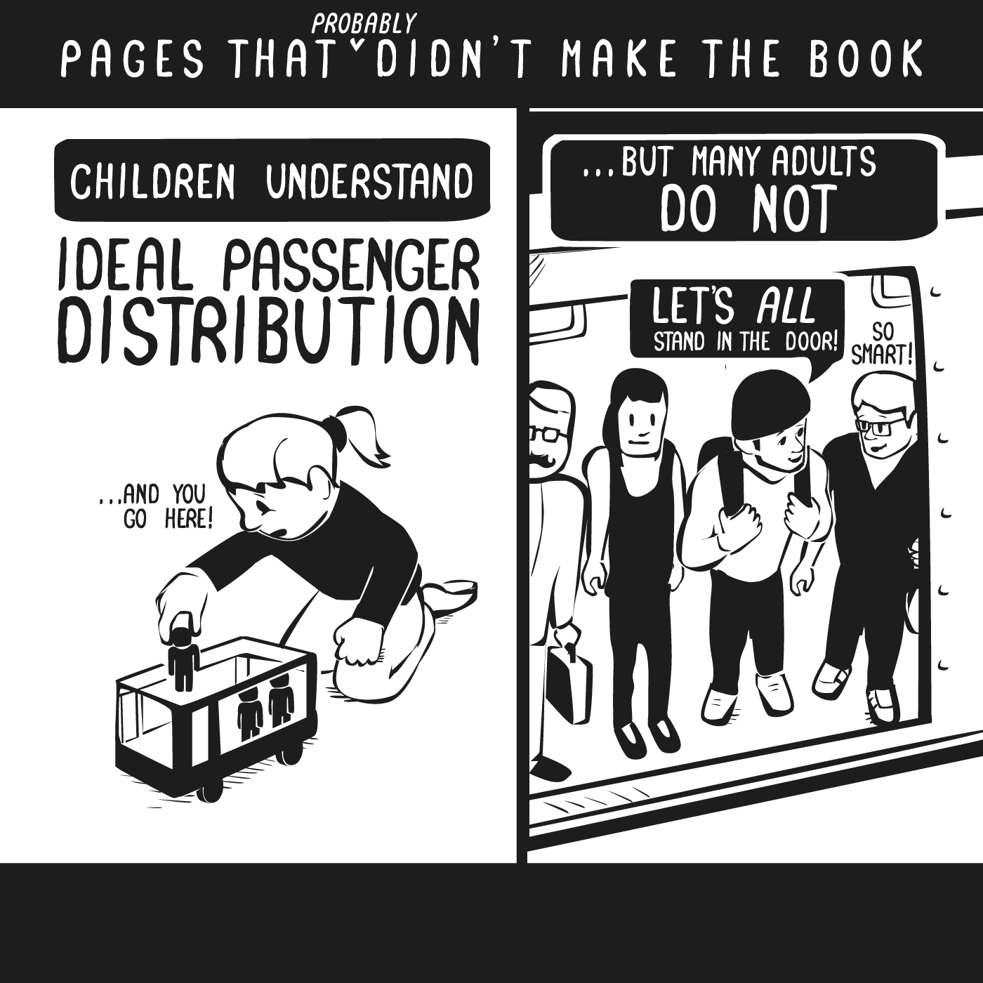
Like not standing directly in front of the doors after entering the subway.

And that the left sides of escalators are for walkers.

And that the city isn’t so hard to navigate once you remember that even streets go east and odd streets go west.

And that you can always identify tourists by their tendency to walk super slowly while looking up.

And so on.

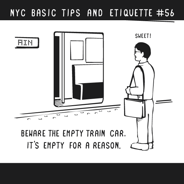
Artist Nathan W. Pyle has taken to illustrating such wisdoms in NYC Basic Tips and Etiquette , his book that comes out next April. He’s sharing illustrations that probably won’t make it—and a few that will—on Facebook, and they’re spot-on and hilarious! I couldn’t help but laugh out loud at many of them.

A few of my faves:

empty subway car

passenger distribution

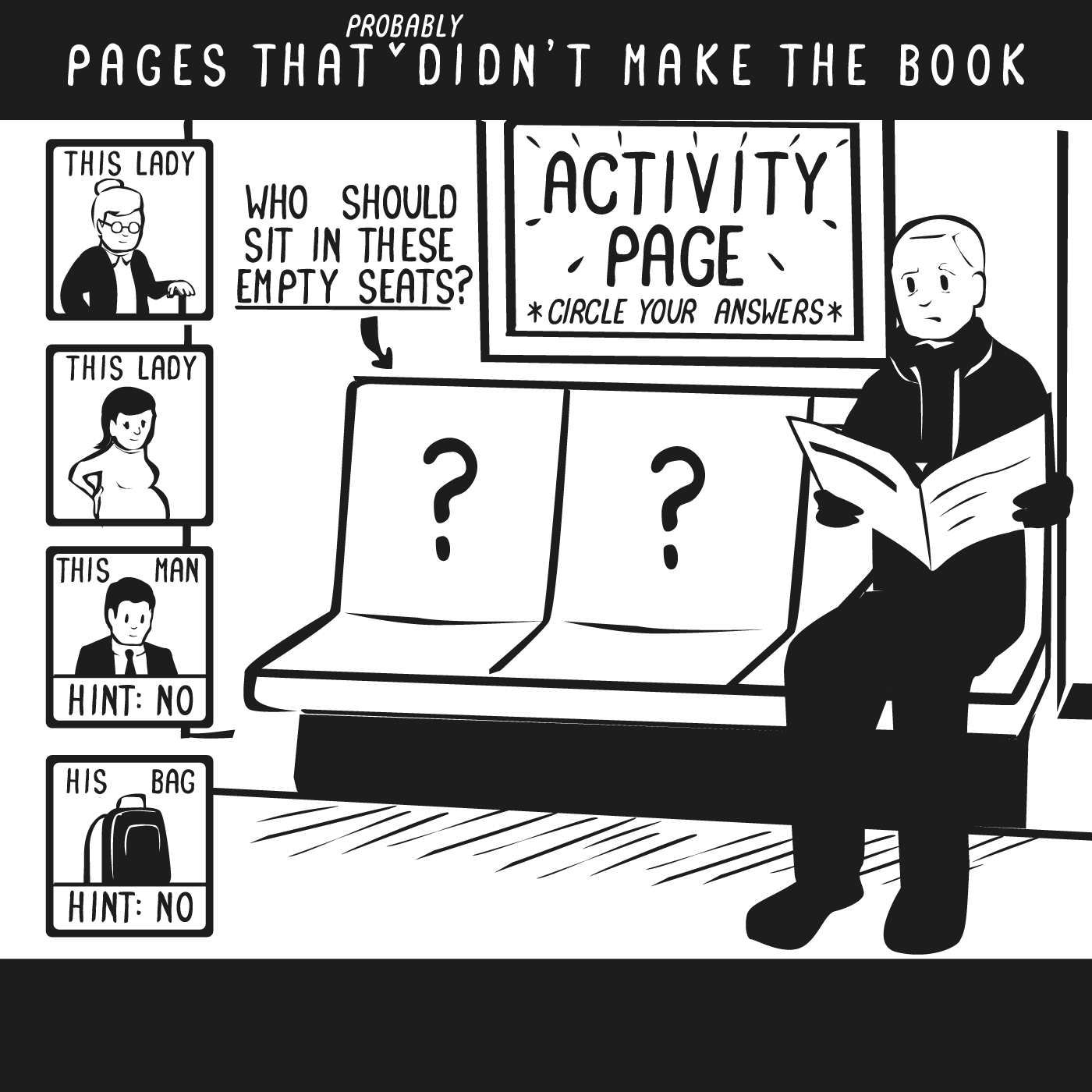
who should sit there?

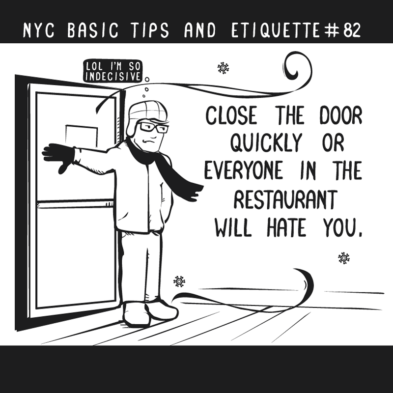
close the door

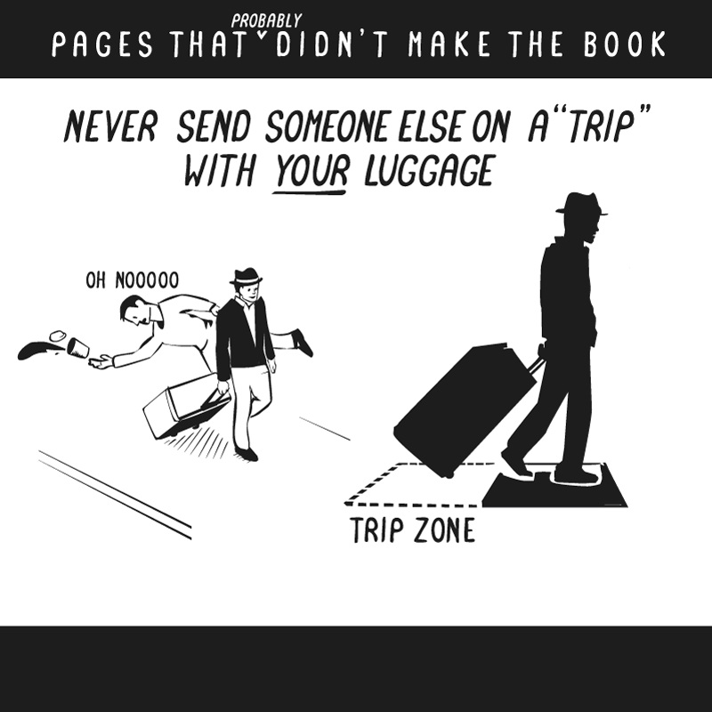
trip zone

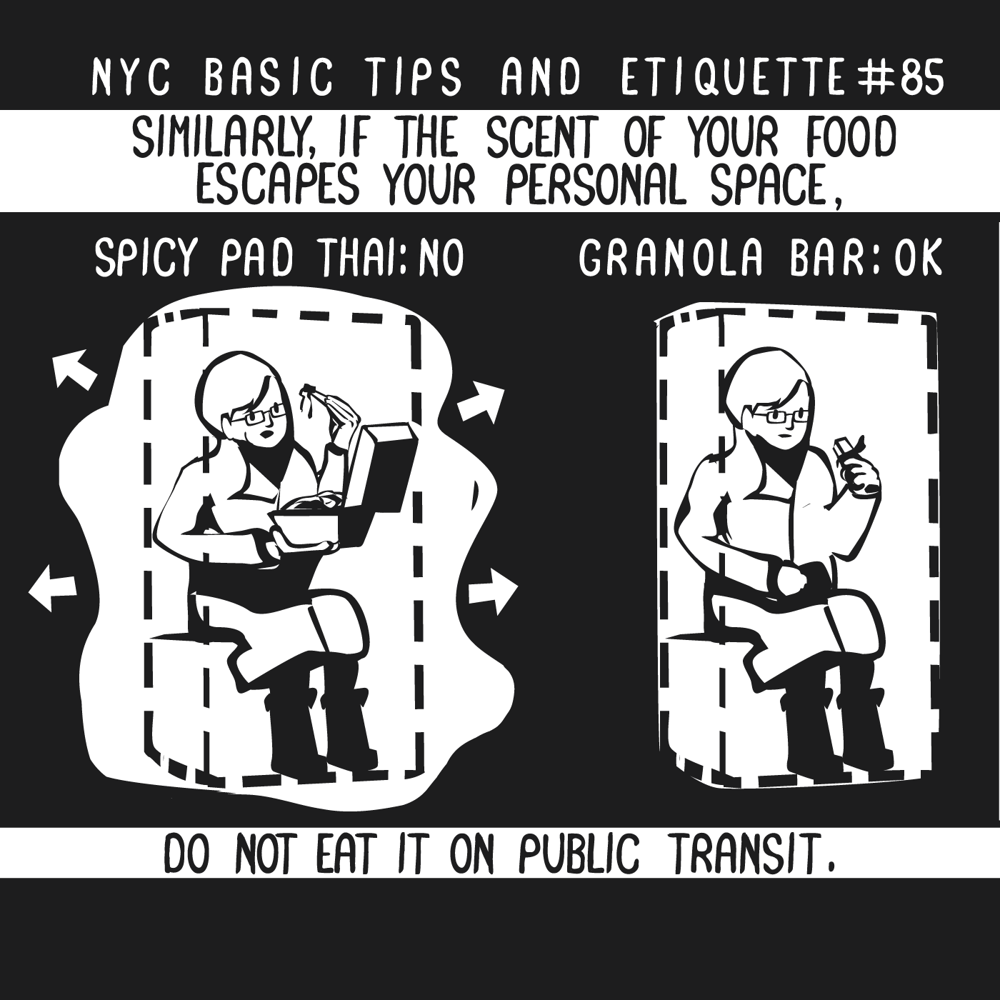
eating on the subway

Genius, right? I can’t wait to see what else Pyle will illustrate. I’m wondering if he’ll design some of my other peeves…like people who bring bikes on the subway…or people who don’t move after going through a revolving door…

What are some of your “favorite” NYC etiquette gripes?

(Illustrations by Nathan W. Pyle via the NYC Basic Tips and Etiquette Facebook page)

The Illustrated Train

I may have been taking public transportation for my entire life, but people-watching on the subway never gets old. Even when I’m trying to block out my fellow commuters—with my headphones turned up and/or a magazine in front of my face—I can’t help but wonder what their backstories are: Why are they also headed home so late? Where are they coming from? Who’s waiting up for them? And so on.

Bee Johnson is similarly intrigued by NYC subway riders. The Harlem-based artist has taken to capturing them in her series, “The Illustrated Train.”

The project is exactly what it sounds like. As Micropolis NYCВ quotes Johnson:

If I happen to be standing on a crowded train and can’t comfortably draw or only have a stop before I have to get off, I’ll try to discreetly snap a photo (no flash!) with my phone and base my illo on that. (I know I sound like a total creep, but what can you do? Sometimes the best ones are gone in a flash.)

A few of my favorites illustrations:

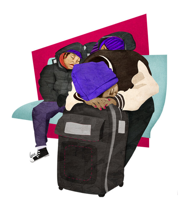
southbound for a sleepover

bronx, party of three

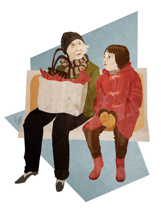
to grandmother's loft we go!

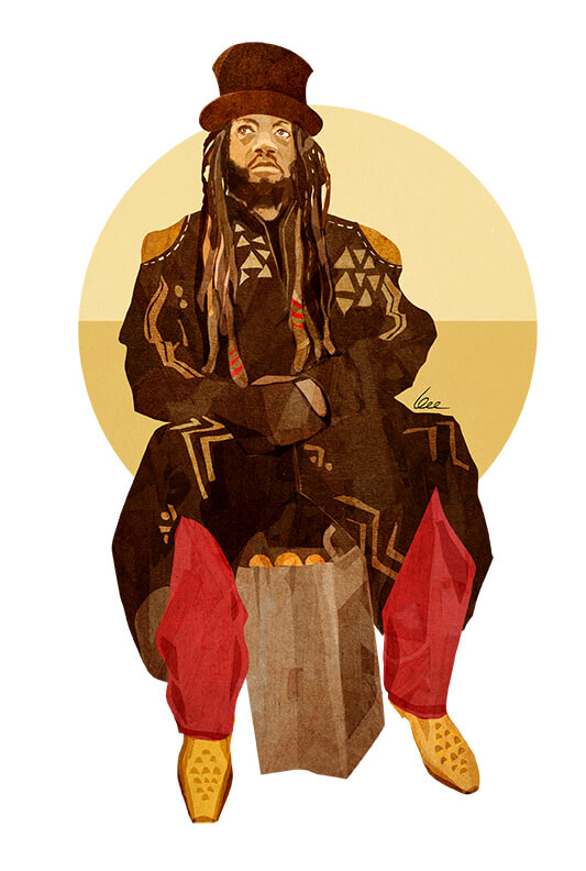
the mad hatter of morningside heights

…funny enough, I see the guy in the last illo all the time on the A train!

(Illustrations by Bee Johnson; found via Micropolis NYC)

Adrian Tomine’s NYC Illustrations

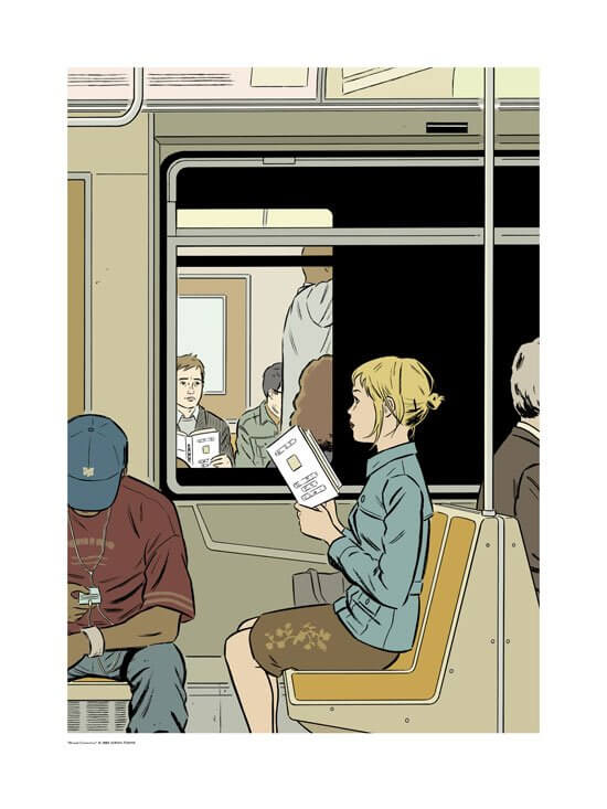
My all-time favorite New Yorker cover is Adrian Tomine‘s “Missed Connection.” It ran on the November 8, 2004 issue, which I purchased more for that illustration than the stories inside. At the time, I was living and working in Boston (albeit, at a pretty great job) but dreaming of being back in NYC. I felt a bit like the girl in the illustration: so close to reaching something that would bring me great happiness, but not quite there. That cover hung above my desk for the next few years, until I made it back to NYC.

Missed Connection

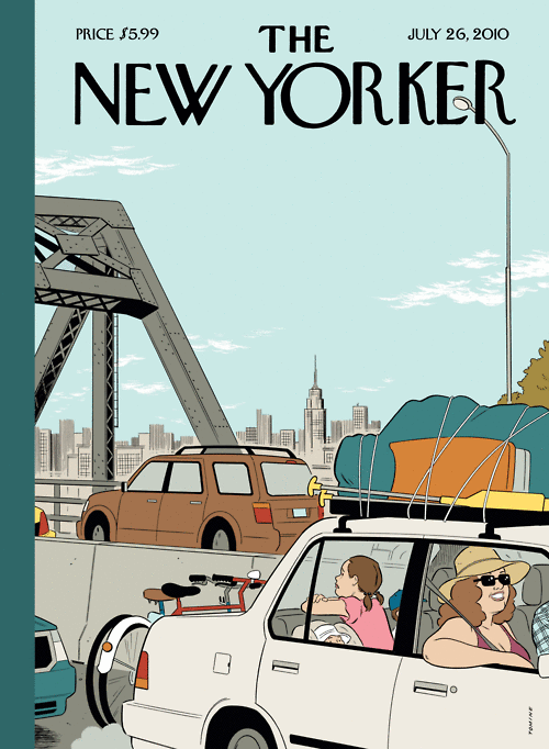
Since the, I’ve been a huge fan of Tomine’s work, especially his NYC-related illustrations. He captures life in the city with amazing poignancy—especially the mundane, everyday details. Like inВ my second-favorite New Yorker cover, “Summer Getaway”В (which I’d posted on Tumblr back in 2010 when I used Tumblr!):

Summer Getaway

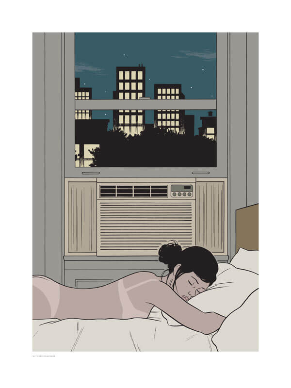
Or in the “AC” illustration below. (Though if that were my apartment, there’d be an open window and no AC! I actually love the thick, NYC summer heat.)

AC

The other day, I learned that you can buy signed Tomine prints from his website—including “Missed Connection” and “AC.” At $250 each, they’re a little out of my price range, but maybe one will eventually hang in my apartment. Tomine also has a new book, New York Drawings , of, well, I’m sure you can guess. I’ll be placing my order!

What’s your all-time favorite New Yorker cover?

(Images via Adrian-Tomine.com)