design

An Alphabet Inspired by Cities

This has to be one of the coolest senior theses I’ve ever seen.

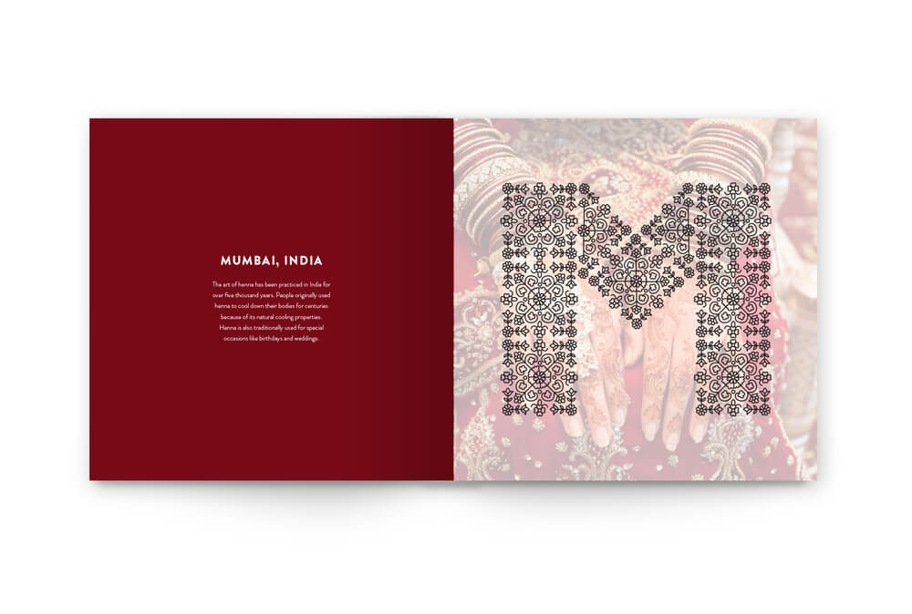
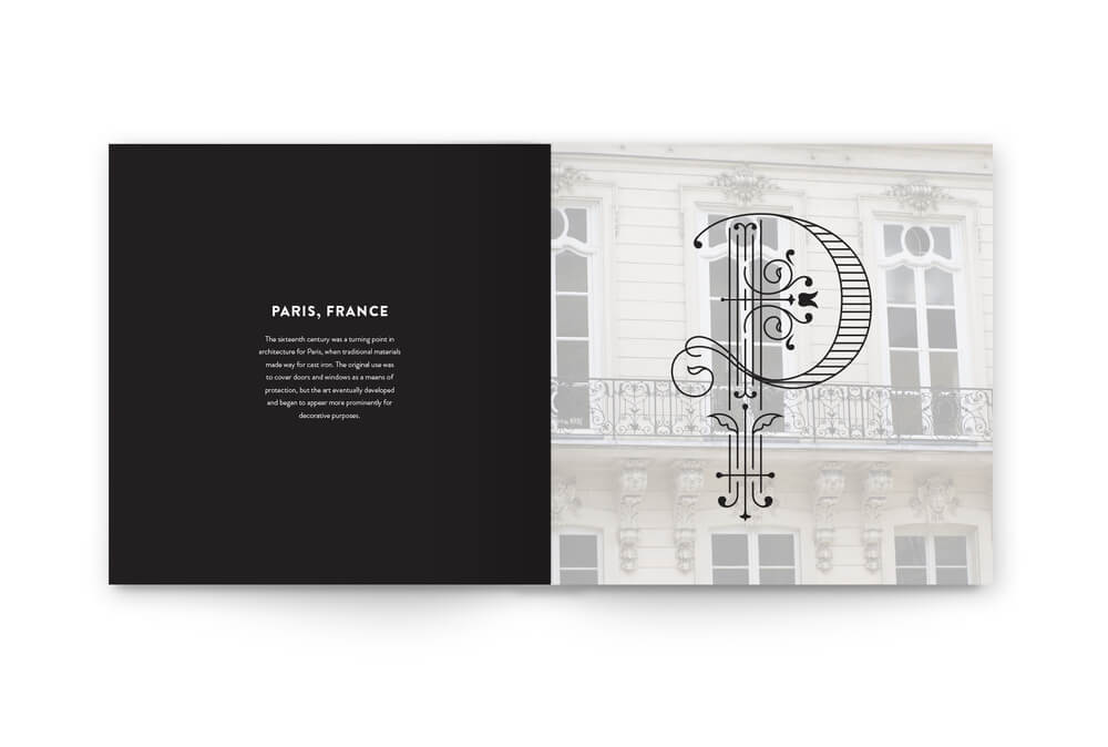
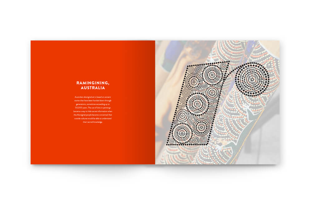
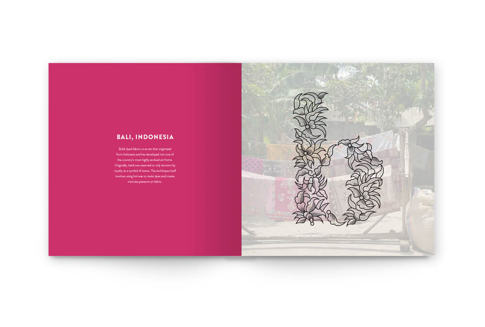
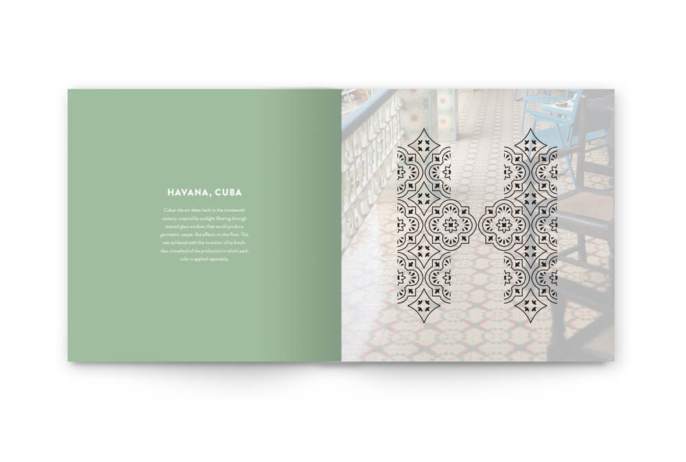
Graphic designer Rebecca Mah created an alphabet in which each letter is inspired by a different city. The letters are meant to be “drop caps,” which are the large first letters at the start of a paragraph, usually in a book.

I loved looking through all the letters, though these especially caught my eye:

B01

H01

M01

P01

R01


See Mah’s full alphabet here. Which is your favorite?

(Images by Rebecca Mah; found via Design Taxi )

Subway Maps You Can Wear on Your Wrist

This is genius.

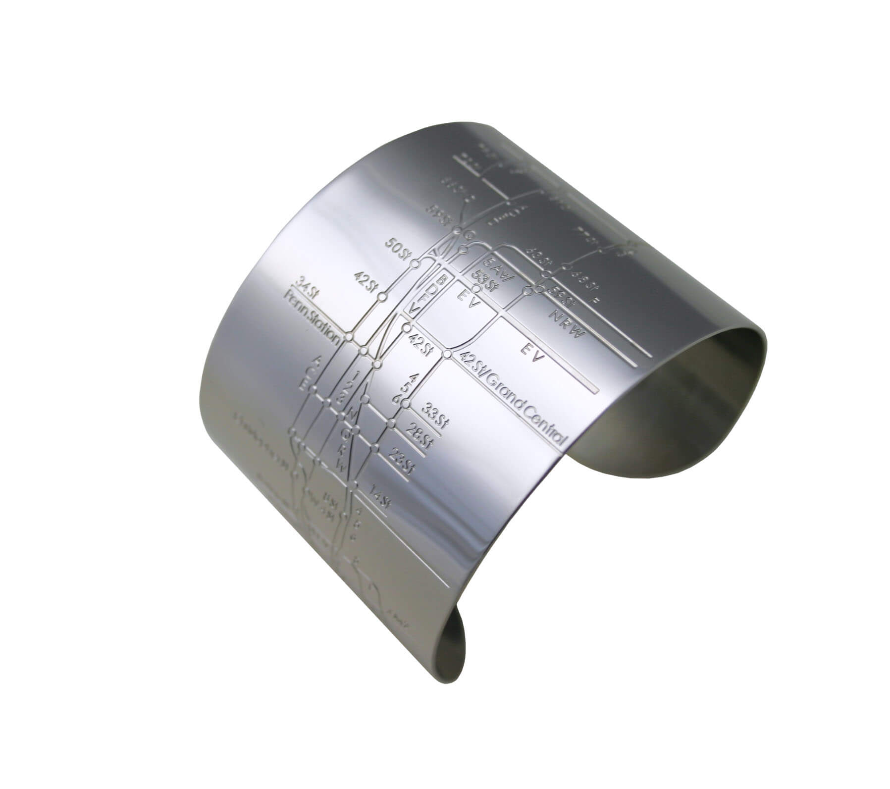
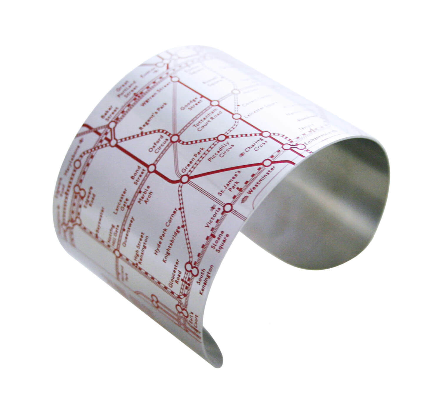
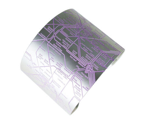
When Tiffany Burnette was researching women who travel solo, for her master’s project, sheВ stumbled upon one voyager’s gripe: Having to pull out a map to navigate the NYC subway—thus clearly branding herself a tourist. Inspired, Tiffany came up with a simple and stylish solution: subway maps embossed on cuff bracelets. While wearing them, female travelers can navigate a transit system with a discreet glance at the wrist.

So far, her company, designhype, has cuffs for NYC

nyc metro cuff

London

london metro cuff

Paris

paris metro cuff

…as well as Milan, Berlin, Chicago and Brooklyn.

As a woman who’s often traveled solo, I can attest to how many times I could have used these! One safety measure I always take when traveling alone is to look like I know where I’m going. And nothing blows your cover more than when you have to study a subway map, whip out a guidebook or consult your smartphone—if you’re in a place where you even get service. These cuffs could have helped me out in several cities.

Plus, I love how the bracelets are very understated, so you wouldn’t be flashing around expensive-looking jewelry. I actually just want the NYC one to wear every day!

Here’s to hoping city map cuffs will be designhype’s next project!

(Photos via designhype; found via Scoutmob)

P.S. — I had an amazing time onВ EleutheraВ and I’m looking forward to posting about it, in a few days!
A Gorgeous NYC Calendar (That Benefits Sandy Relief)

A NEW YORK CALENDAR TO RAISE FUNDS FOR SANDY RELIEF

It’s no secret how much I love my hometown. So I was thrilled when I came across this gorgeous 2013 calendar of NYC images, by Jenna Park, a Brooklyn-based designer. The photos are just breathtaking. I love their dreamy feel and how they represent a variety of local places.

In a very nice gesture, 30% of proceeds of calendars purchased this month will go to NYC organizations that are aiding Hurricane Sandy victims. Now that’s definitely a reason to feel good about buying one now—especially since parts of the city are still struggling with the aftermath.

And while I’m on the topic of Sandy: Tragically, a friend of our family was one of the hurricane’s victims. Jeffrey Chanin was a retired NYPD sergeant who was killed when a tree fell through his house the night of the storm. He leaves behind a wife and four children. If you’re interested in making a donation to the family, it can be sent to The Chanin Family Fund, P.O. Box 739, PearlВ River, NY 10965.

(Image via Sweet Find Day, found via A Cup of Jo)

Would You Live in a Water Tower?

I’m going to answer my own question: Yes. Absolutely. But only if said water tower looked like this:

converted water tower

Tom Dixon, a British design and manufacturing company, converted a 60-foot water tower, in North Kensington, London, into a gorgeous apartment. It has three floors complete with a kitchen, living room, two bedrooms, two bathrooms, a living room and (sigh of envy) a roof terrace. It’s going for $3,900 a month–which, scarily, isn’t too bad if you compare it to NYC prices for similarly sized digs.

I love how the big windows lets lots of light into the space:

converted water tower

converted water tower

converted water tower

converted water tower

There are tons of water towers in NYC. I’m wondering when someone will convert one into a luxury apartment here on this side of the pond!

converted water tower

(Photos via Gizmag, via Architizer; thanks to Shawn for introducing me to the link)

The Tutu Project

Last week, I stumbled upon an amazing exhibit via Canadian Art Junkie. To celebrate its 60th anniversary, the National Ballet of Canada is presenting “The Tutu Project,” a display of 60 original tutus. Some are iconic costumes from renowned ballets; others are whimsical creations from artists, ballet fans and even the dancers, themselves. The exhibit is running from July 11 through September 2 at Toronto’s Design Exchange.

While I’d love to see it live, that’s probably not happening. But on the upside, the National Ballet has a very nice online gallery showcasing many of the tutus, as well as photos of ballerinas wearing them in action:

Kitri, Act III from Don Quixote. Designed by Desmond Heeley. Photo by Setareh Sarmadi.

Gizella Witkowsky in Don Quixote. Photo by Barry Gray.

Wilis from Giselle. Designed by Desmond Heeley. Photo by Setareh Sarmadi.

Artists of the Ballet in Giselle (2009). Photo by Bruce Zinger.

The Firebird. Designed by Santo Loquasto. Photo by Setareh Sarmadi.

Jennifer Fournier in The Firebird (2006). Photo by Dale Dong.

The tutus created for the exhibit are just as gorgeous as the ones designed for the stage. Two of my favorites:

Designed and built by Krane Design. Selected by the Fashion Design Council of Canada. Photo by Setareh Sarmadi.

Designed and built by Louise Yu. National Open-call for Artists selection. Photo by Setareh Sarmadi.

What’s your favorite ballet costume? Most recently, I was pretty dazzled by the new costumes City Ballet wore for “Symphony in C” this season.

(Photos via the National Ballet’s Tutu Project; and thanks to BoomerOntario for first posting about this at Canadian Art Junkie)