This has to be one of the coolest senior theses I’ve ever seen.
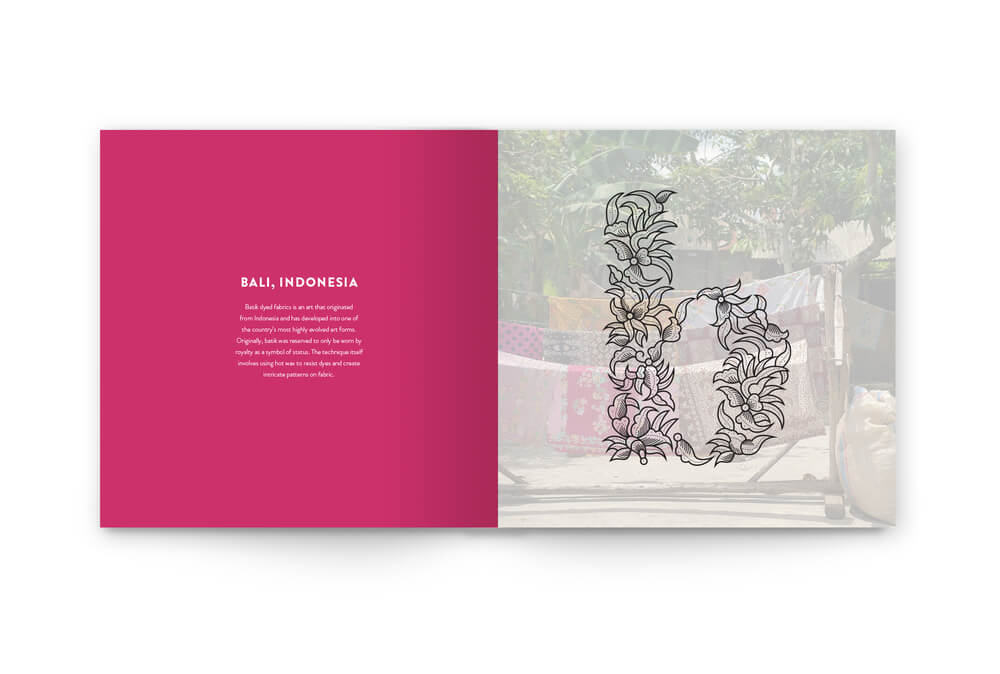
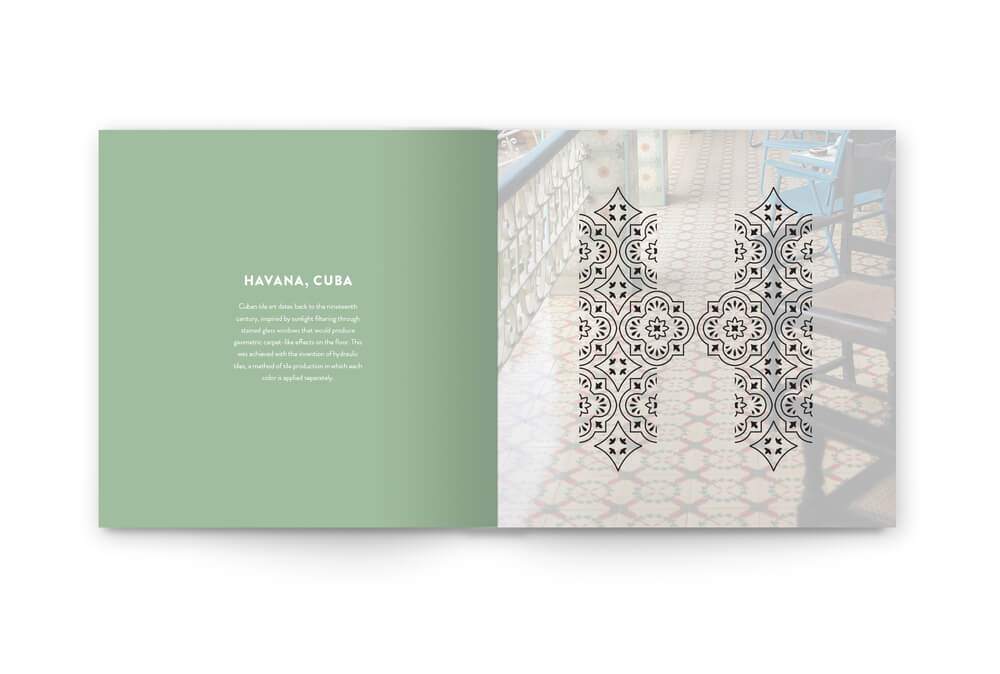
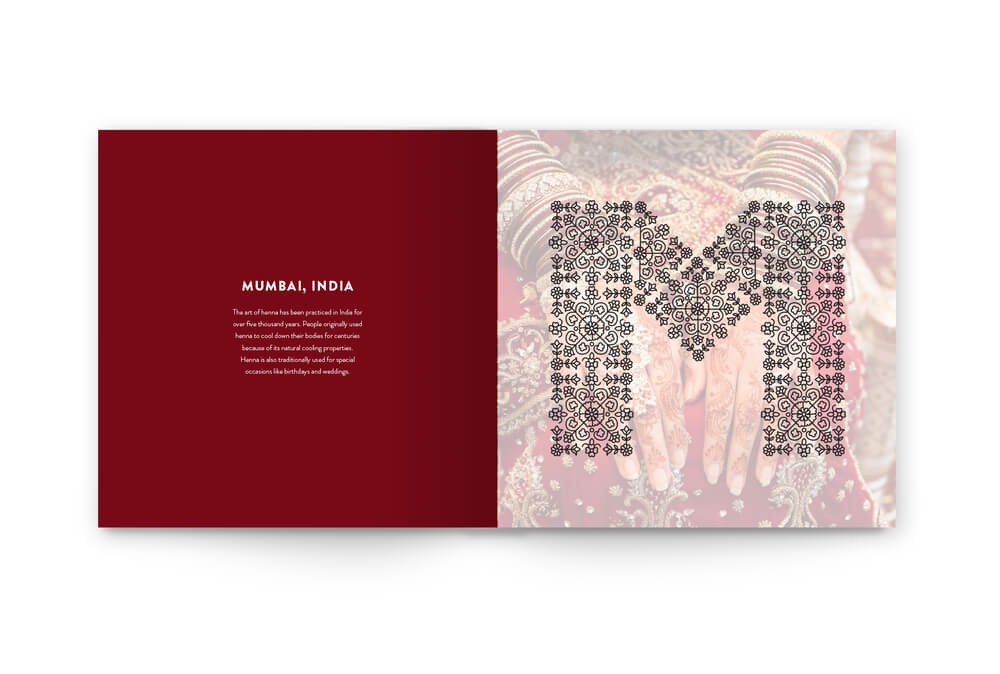
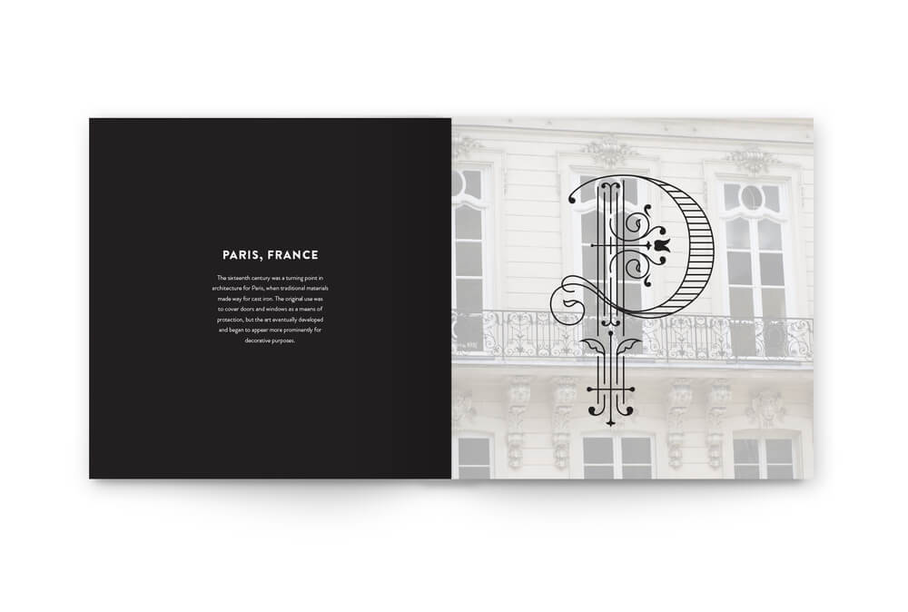
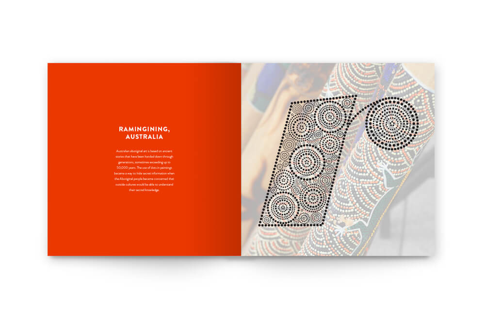
Graphic designer Rebecca Mah created an alphabet in which each letter is inspired by a different city. The letters are meant to be “drop caps,” which are the large first letters at the start of a paragraph, usually in a book.
I loved looking through all the letters, though these especially caught my eye:
See Mah’s full alphabet here. Which is your favorite?
(Images by Rebecca Mah; found via Design Taxi )
Reblogged this on Dezired Designs.
So neat!
Thank you! Glad you enjoyed it, as well!